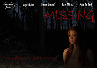
We decided that between our two poster designs.
1. A missing poster style
2. An image of the character on an appropriate scenery background (woods or alley as featured in the trailer)
We chose the second idea. The reason for this is that although the first may be more creative and initially eye catching. From our research found the second design is commonly used which suggests it is effective and has been tried and tested on our target audience. Another reason was with creating a missing poster, this could be potentially offensive or controversial for some viewers who may have personal experiences with this theme and may find our use of these important missing posters as crude, and we don't want to eliminate this audience segment.
We chose to use woods at night as the background for both our poster and magazine cover as they are dark and sinister and carry with them typical connotations of mystery and horror. This way the iconic background will create the dark and mysterious tone we are trying to achieve and also the use of woods that also feature in the trailer adds a sense of continuity.
I took some photos of the woods at night that we are experimenting with in our design.
I think the photos are quite effective as they look dark, eerie and mysterious which is appropriate for the tone of our campaign. But also, although they look quite dark in this small scale they were at twilight which adds the purple, blue hues in the background, which both add interest and atmosphere to the photos but also the backlight picks out the shapes of the trees to make the location clear.
We developed a basic first draft of the poster:

However, as well as being too dark we wanted to develop the image, fonts and logo to make it more eye catching and effective.
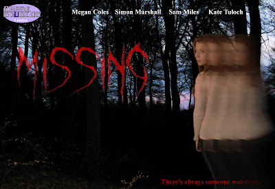
The final design is this:

The final design is much more powerful and effective. The primary optical area, similar to those from my research is the character image, and this image is very appropriate. The fact she is looking over her shoulder is appropriate for the theme and plot and ties in with the tagline written below. The effect is also appropriate as the fading image connotes her dissapearance which is the primary enigma within the plot and trailer building continuity across the products. The title font is also suitably mysterious and characteristic of chiller or thriller elements. The photo of the woods is dark, mysterious and again builds continuity as woods are featured in the end of the trailer. We also intend to carry this brand identity and continuity onto the magazine cover as well. Finally the logo in the corner adds authenticity to the poster.


No comments:
Post a Comment