We've come up with some ideas for the designs we'd like and the photos we'll need to make them work. We've thought of either a 'missing poster' style film poster as this would immediately attract attention, but another idea was a photograph of the protagonist with a background of appropriate scenery such as woods or an urban alleyway, we feel this might be less initially powerful but allows more versatility to establish the mood and tone we're trying to achieve throughout the products. But we've decided to take lots of different angles and expression so we can see which works best with whatever we decide for our final idea.
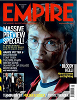
I've also been researching magazine covers to prepare for having to design and create one as part of our secondary components to the campaign. The visual images featuring in film magazines from my research shares many qualities and conventions with film posters. From research of many co
 vers and as can be seen in the examples, they similarly use very strong, dominant images of the central characters as the primary optical area and then a background of either a film scene or other appropriate scenery or commonly a blank colour or blend of colours. Much like a film poster they are designed to attract attention in a short time, with bold, strong stances and expressions from the large character images. However, they have the advantage of additional features of other films and articles advertised on the front page which can attract a much wider demographic, so magazines are an important tool to reach out to all audience segments. The title of the magazine is also a prominent visual point on the magazine which is an advantage if its a popular magazine as this iconic brand name will build a much larger audience.
No comments:
Post a Comment