This was the final design:
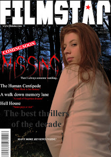
The font is appropriate for the title 'missing' as it looks mysterious and appropriately coloured as red connotes danger. Although magazine covers usually use a bolder title font, we chose to challenge this convention as we thought this font was more appropriate to the thriller influences of our trailer which the magazine is focusing on as an article, as there are other thriller features included. We also thought it was more eye catching and found a select few covers from research did use a less conventional font. The magazine looks effective and realistic as it features other articles using an interesting range of colours and fonts to attract attention. The magazine title is bold and prominent as we found from research they usually are and the use of a star logo in the 'A' is an effective touch to create a 'brand identity' for our imaginary magazine. Although, the photo is not one of the finals we had decided on, it seemed the one that fitted most appropriately and the partial shot of her face connotes mystery and vulnerability, whereas the strong expression stands out and draws attention. Also from research we found this neutral dominant expression to be the most effective and commonly used, so as to comply with magazine conventions.
No comments:
Post a Comment