Monday, 22 March 2010

Magzine cover

Recently we've been completing the magazine cover element of our campaign. To ensure a strong sense of continuity between the three components, we've also chosen to use the dark woods images as a background for the magazine cover. From research appropriate scenery is a commonly used and effective background for film magazines. The primary optical area will be a character image, as we found was common from research and increases continuity as well as character recognition. The conventions for a magazine cover are much more limited as opposed to a poster, as they feature the magazines other elements as well, such as title and other articles. This and the fact we wanted the cover to be similar to the poster to create continuity across the components, made the design process much simpler as we knew the basic components and just had to brainstorm some ideas for other articles. We also settled on the title 'Filmstar' for the magazine as it's short, snappy and thematically appropriate.


This was the final design:
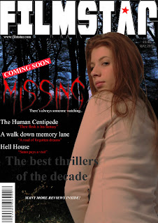


The font is appropriate for the title 'missing' as it looks mysterious and appropriately coloured as red connotes danger. Although magazine covers usually use a bolder title font, we chose to challenge this convention as we thought this font was more appropriate to the thriller influences of our trailer which the magazine is focusing on as an article, as there are other thriller features included. We also thought it was more eye catching and found a select few covers from research did use a less conventional font. The magazine looks effective and realistic as it features other articles using an interesting range of colours and fonts to attract attention. The magazine title is bold and prominent as we found from research they usually are and the use of a star logo in the 'A' is an effective touch to create a 'brand identity' for our imaginary magazine. Although, the photo is not one of the finals we had decided on, it seemed the one that fitted most appropriately and the partial shot of her face connotes mystery and vulnerability, whereas the strong expression stands out and draws attention. Also from research we found this neutral dominant expression to be the most effective and commonly used, so as to comply with magazine conventions.

Tuesday, 9 March 2010

Poster

We decided that between our two poster designs.

1. A missing poster style

2. An image of the character on an appropriate scenery background (woods or alley as featured in the trailer)

We chose the second idea. The reason for this is that although the first may be more creative and initially eye catching. From our research found the second design is commonly used which suggests it is effective and has been tried and tested on our target audience. Another reason was with creating a missing poster, this could be potentially offensive or controversial for some viewers who may have personal experiences with this theme and may find our use of these important missing posters as crude, and we don't want to eliminate this audience segment.

We chose to use woods at night as the background for both our poster and magazine cover as they are dark and sinister and carry with them typical connotations of mystery and horror. This way the iconic background will create the dark and mysterious tone we are trying to achieve and also the use of woods that also feature in the trailer adds a sense of continuity.

I took some photos of the woods at night that we are experimenting with in our design.


I think the photos are quite effective as they look dark, eerie and mysterious which is appropriate for the tone of our campaign. But also, although they look quite dark in this small scale they were at twilight which adds the purple, blue hues in the background, which both add interest and atmosphere to the photos but also the backlight picks out the shapes of the trees to make the location clear.
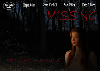
We developed a basic first draft of the poster:


However, as well as being too dark we wanted to develop the image, fonts and logo to make it more eye catching and effective.

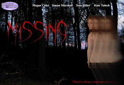
The final design is this:


The final design is much more powerful and effective. The primary optical area, similar to those from my research is the character image, and this image is very appropriate. The fact she is looking over her shoulder is appropriate for the theme and plot and ties in with the tagline written below. The effect is also appropriate as the fading image connotes her dissapearance which is the primary enigma within the plot and trailer building continuity across the products. The title font is also suitably mysterious and characteristic of chiller or thriller elements. The photo of the woods is dark, mysterious and again builds continuity as woods are featured in the end of the trailer. We also intend to carry this brand identity and continuity onto the magazine cover as well. Finally the logo in the corner adds authenticity to the poster.

Friday, 5 March 2010

Finalising trailer and adding music

We've now finally completed editing the visual aspects of our trailer using imovie. It runs at about 1 minute which is typically long for a teaser trailer but within the boundaries of teaser trailer conventions. The final step to complete our project is to add music.
We have been searching the copyright free music sites and have found three sites we considered to have some effective soundtrack music.
They were:
http://www.soundjay.com/free-music.html
http://derekaudette.ottawaarts.com/music.php
http://www.jamendo.com/en/albums

After searching through some of the music on these sites, we decided on a combination of two pieces of music to incorporate in our trailer. The first is called 'Cautious path' and is taken from the first website written above. This is quite a slow, eerie and mysterious beat we think will establish the desired tone and mood of the trailer.
The second piece is the instrumental introduction from a song called 'Behind you' by an artist called Magdalen Graal, which was found on the third website written above. This is a much more upbeat tempo which we would like to use in the later part of the trailer as from my research I found is common in trailers to crescendo and heighten the drama. The faster tempo will also add a sense of speed to the chase featured in our trailer. We will be working now to add the pieces of music so they fit smoothly and effectively to finish off the trailer and add power and impact to support the visual aspects. We may also use a sound effect, most likely a heartbeat.

We have now also decided on the tile of 'Missing' for our film. We chose this as a one word title, similarly to 'Taken' which was the primary film for my research, is bold, powerful and can often have the most impact. The word is also very direct and relevant to the primary theme of our trailer/film.

Thursday, 4 March 2010

Photo results

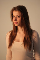
We took all the photos for both the poster and magazine cover earlier in the photography suite at college. We are pretty pleased with the outcome and from the many photos we took, three types have stood out as potentially being used


This style looks quite strong and dominant although her serious expression could be interpreted as vulnerable which would better suit our trailer. However as this is quite a strong photo it would stand out well on particularly a poster and from my research I've found strong character images to be effective and commonly used.



Another type we thought was good, was this turning over the shoulder shot. It is another fairly strong photo but with the way her hair moves in this particular image it looks more feminine which adds a vulnerability and interest to the image making it more appropriate for her character. Similarly the fact she is looking over her shoulder is suitable for the theme and plot. This photo would look quite interesting and eye catching on a magazine cover or poster.


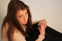
This was the final style we liked. Although it is not as strong an image it does seem very appropriate to her character as the high angle looking down makes her appear very vulnerable.
Now we've taken the photos and narrowed down our selections we will come up with a few designs we think will be effective and create our ancillary marketing components.

Monday, 1 March 2010

Magazine cover research and preparing for photos

As well as continuing our hunt for good music and finalising editing we've made plans to take the photos that will feature on both our poster and our magazine cover later this week. I've arranged for my friend to come to our college photography suite so that we can have the protagonist of our trailer in both still image pieces to create the important sense of continuity across the campaign products. We've booked out the suite and my partner who is studying photography is using her camera.

We've come up with some ideas for the designs we'd like and the photos we'll need to make them work. We've thought of either a 'missing poster' style film poster as this would immediately attract attention, but another idea was a photograph of the protagonist with a background of appropriate scenery such as woods or an urban alleyway, we feel this might be less initially powerful but allows more versatility to establish the mood and tone we're trying to achieve throughout the products. But we've decided to take lots of different angles and expression so we can see which works best with whatever we decide for our final idea.

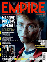
I've also been researching magazine covers to prepare for having to design and create one as part of our secondary components to the campaign. The visual images featuring in film magazines from my research shares many qualities and conventions with film posters. From research of many covers and as can be seen in the examples, they similarly use very strong, dominant images of the central characters as the primary optical area and then a background of either a film scene or other appropriate scenery or commonly a blank colour or blend of colours. Much like a film poster they are designed to attract attention in a short time, with bold, strong stances and expressions from the large character images. However, they have the advantage of additional features of other films and articles advertised on the front page which can attract a much wider demographic, so magazines are an important tool to reach out to all audience segments. The title of the magazine is also a prominent visual point on the magazine which is an advantage if its a popular magazine as this iconic brand name will build a much larger audience.