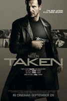
I decided to look at the film poster for the film Taken which I used as trailer research earlier, as it has similar themes to our own film and this way I can see the use of continuity between both elements of the campaign.
 The primary optical area of this poster would seem to be the main character placed in the foreground holding a gun prominently in front of himself. The star appeal of this famous actor will create an initial recognition for the audience and those who like this actor will be intrigued to find out more. The gun is also used to connote the theme of danger and the action/thriller genre in a simple but highly iconic symbol. This is effective on a poster to convey the desired theme and genre in a simple image. The stance and facial expression of the characters are also important, in this case the stance is strong and determined reflecting the characteristics of the character and their role in the film. The facial expression supports this as its hard and stern, conveying drama and intensity. The title is also placed prominently in the foreground in a bold and solid font which once again connotes strength and power and ties in with the style of the poster. The steely, grey colour scheme is very strong and creates an impact and strong tone to the poster. Without the use of bold colours the attention is all focused on the primary optical areas and important visual tools to create an effective still image which captures the essence of the film. A sense of brand continuity is created between the trailer and poster as similarly to the poster the trailer doesn't use bright, bold colours or overpowering music but instead also uses bold, strong and effective shots and images to convey the powerful, strong tone they have created across the marketing campaign.
From looking at this poster and some other ones from the action/thriller genre, I've found generally the most important visual impact comes from the characters and their facial expression and stance. The background is then made up of smaller shots of the film, an appropriate scenery or just a basic colour palette.
No comments:
Post a Comment