After the set back of the last attempt to film the main bulk of our trailer, I've got hold of three other cameras I can use. Last night I experimented with all three outside in the evening when it was beginning to get dark and have chosen one that is sophisticated enough to film in the semi-darkness but capture a much more high quality picture.
I've made plans to film over the christmas break from college ensuring my friend has some time available. So that we can finish filming soon after the new year then edit and focus on the secondary elements of our campaign.
Tuesday, 15 December 2009
Tuesday, 8 December 2009
Filming results
Unfortunately, although I did manage to get all the shots I wanted within the time slot of good light. The camera I had available to me was not good enough to capture the images with limited light, making all of the footage unusable. This is a frustrating set back, but I'm trying to get hold of a better camera at the moment to try again.
However, this did mean I had some extra practice at getting the type of shots I wanted and handling the camera, we could also see which shots were effective and which weren't such as the POV shot included in the storyboard, which we decided looked too amateur and unsophisticated as we don't have the technology available to make it look effective and life like, so it is unlikely this shot will be included in the final product.
However, this did mean I had some extra practice at getting the type of shots I wanted and handling the camera, we could also see which shots were effective and which weren't such as the POV shot included in the storyboard, which we decided looked too amateur and unsophisticated as we don't have the technology available to make it look effective and life like, so it is unlikely this shot will be included in the final product.
Monday, 30 November 2009
Filming plans and storyboarding
I've now made plans with my friend to film this week. I've checked the time the sun sets to try and find the ideal half hour slot where there will be enough light to have a good image but it will look effectively dark on camera. We've now developed a much more detailed and cohesive storyboard/shot list of this main part of the trailer so we can take this with us, and know which shots we want. I've included a photo of each location the shot will be filmed at and a short description of the shots we have decided on. This is a useful tool, particularly with the limited filming slot we have.
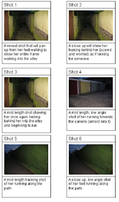 Shot 1: A reveal shot that will pan up from her feet walking to show her entire frame walking into the alley
Shot 2: A close up will show her looking behind her (scared and worried) as if looking for someone
Shot 3: A mid length shot showing her once again looking behind her into the alley and beginning to run
Shot 4: A mid length, low angle shot of her running towards the camera (almost into it)
Shot 5: A mid length tracking shot of her running along the path
Shot 6: A close up, low angle shot of her feet running along the path
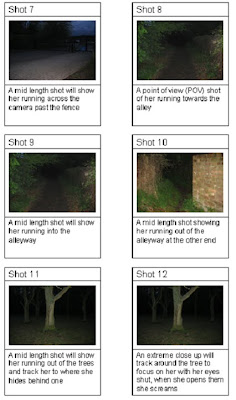
Shot 7: A mid length shot will show her running across the camera past the fence
Shot 8: A point of view (POV) shot of her running towards the alley
Shot 9: A mid length shot will show her running into the alleyway
Shot 10: A mid length shot showing her running out of the alleyway at the other end
Shot 11: A mid length shot will show her running out of the trees and track her to where she hides behind one
Shot 12: An extreme close up will track around the tree to focus on her with her eyes shut, when she opens them she screams
(The only shot not included on this storyboard we have decided to film on this shoot, is a shot of the protagonist character being watched through her bedroom window)
We've used a combination of mid range shots which are effective to show the settings and environments of each shot, as well as close ups for emotional effect and personal connection with the character. Some tracking shots are included to add a sense of pace and speed to the chase. The POV shot we used to try and include the audience and put them in the characters position which is an effective audience gratification.
As well as some of these I will experiment with anything else that seems like an effective idea on location. However when I review the filming the shots used may be subject to a change in order depending what looks most effective, but it will probably remain quite similar to our storyboard.
 Shot 1: A reveal shot that will pan up from her feet walking to show her entire frame walking into the alley
Shot 2: A close up will show her looking behind her (scared and worried) as if looking for someone
Shot 3: A mid length shot showing her once again looking behind her into the alley and beginning to run
Shot 4: A mid length, low angle shot of her running towards the camera (almost into it)
Shot 5: A mid length tracking shot of her running along the path
Shot 6: A close up, low angle shot of her feet running along the path

Shot 7: A mid length shot will show her running across the camera past the fence
Shot 8: A point of view (POV) shot of her running towards the alley
Shot 9: A mid length shot will show her running into the alleyway
Shot 10: A mid length shot showing her running out of the alleyway at the other end
Shot 11: A mid length shot will show her running out of the trees and track her to where she hides behind one
Shot 12: An extreme close up will track around the tree to focus on her with her eyes shut, when she opens them she screams
(The only shot not included on this storyboard we have decided to film on this shoot, is a shot of the protagonist character being watched through her bedroom window)
We've used a combination of mid range shots which are effective to show the settings and environments of each shot, as well as close ups for emotional effect and personal connection with the character. Some tracking shots are included to add a sense of pace and speed to the chase. The POV shot we used to try and include the audience and put them in the characters position which is an effective audience gratification.
As well as some of these I will experiment with anything else that seems like an effective idea on location. However when I review the filming the shots used may be subject to a change in order depending what looks most effective, but it will probably remain quite similar to our storyboard.
Monday, 23 November 2009
Film poster research
Now that I've seen some locations and we've decided on our protagonist, I've been thinking about some ideas for our film poster. However, we've decided not to create our poster until after the trailer is filmed; this is a precaution just in case our actress pulls out or we find a different location or style to the trailer, as we know with this sort of project, it can be subject to drawbacks and change. So instead I've been researching film posters to see how they market the film in one still image and create high impact and brand continuity in one image as most people will only pay very short attention to a poster, so its important to convey the mood and tone effectively in the images chosen.
I decided to look at the film poster for the film Taken which I used as trailer research earlier, as it has similar themes to our own film and this way I can see the use of continuity between both elements of the campaign.
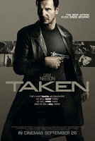 The primary optical area of this poster would seem to be the main character placed in the foreground holding a gun prominently in front of himself. The star appeal of this famous actor will create an initial recognition for the audience and those who like this actor will be intrigued to find out more. The gun is also used to connote the theme of danger and the action/thriller genre in a simple but highly iconic symbol. This is effective on a poster to convey the desired theme and genre in a simple image. The stance and facial expression of the characters are also important, in this case the stance is strong and determined reflecting the characteristics of the character and their role in the film. The facial expression supports this as its hard and stern, conveying drama and intensity. The title is also placed prominently in the foreground in a bold and solid font which once again connotes strength and power and ties in with the style of the poster. The steely, grey colour scheme is very strong and creates an impact and strong tone to the poster. Without the use of bold colours the attention is all focused on the primary optical areas and important visual tools to create an effective still image which captures the essence of the film. A sense of brand continuity is created between the trailer and poster as similarly to the poster the trailer doesn't use bright, bold colours or overpowering music but instead also uses bold, strong and effective shots and images to convey the powerful, strong tone they have created across the marketing campaign.
From looking at this poster and some other ones from the action/thriller genre, I've found generally the most important visual impact comes from the characters and their facial expression and stance. The background is then made up of smaller shots of the film, an appropriate scenery or just a basic colour palette.
I decided to look at the film poster for the film Taken which I used as trailer research earlier, as it has similar themes to our own film and this way I can see the use of continuity between both elements of the campaign.
 The primary optical area of this poster would seem to be the main character placed in the foreground holding a gun prominently in front of himself. The star appeal of this famous actor will create an initial recognition for the audience and those who like this actor will be intrigued to find out more. The gun is also used to connote the theme of danger and the action/thriller genre in a simple but highly iconic symbol. This is effective on a poster to convey the desired theme and genre in a simple image. The stance and facial expression of the characters are also important, in this case the stance is strong and determined reflecting the characteristics of the character and their role in the film. The facial expression supports this as its hard and stern, conveying drama and intensity. The title is also placed prominently in the foreground in a bold and solid font which once again connotes strength and power and ties in with the style of the poster. The steely, grey colour scheme is very strong and creates an impact and strong tone to the poster. Without the use of bold colours the attention is all focused on the primary optical areas and important visual tools to create an effective still image which captures the essence of the film. A sense of brand continuity is created between the trailer and poster as similarly to the poster the trailer doesn't use bright, bold colours or overpowering music but instead also uses bold, strong and effective shots and images to convey the powerful, strong tone they have created across the marketing campaign.
From looking at this poster and some other ones from the action/thriller genre, I've found generally the most important visual impact comes from the characters and their facial expression and stance. The background is then made up of smaller shots of the film, an appropriate scenery or just a basic colour palette.
Tuesday, 17 November 2009
Storyboarding
We've recently been developing our shot ideas and initial storyboard and created a very basic electronic storyboard template on Microsoft Word to create a more developed and structured storyboard for our trailer. Using this template we've discussed our initial shot ideas and developed these into a sequence.
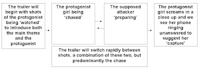
Now we have a more developed idea of our plans, I have contacted our main actress and we have arranged a time to film this main bulk of the trailer. We briefly discussed costume, but as we want to make our trailer look authentic and follow the classic Hollywood realism popular in Western cinema, she will just be wearing plain jeans, causal shoes and a plain coat.

Now we have a more developed idea of our plans, I have contacted our main actress and we have arranged a time to film this main bulk of the trailer. We briefly discussed costume, but as we want to make our trailer look authentic and follow the classic Hollywood realism popular in Western cinema, she will just be wearing plain jeans, causal shoes and a plain coat.
Tuesday, 10 November 2009
Locations
We're now starting to develop a fuller storyboard and establish filming plans so I've spent the last week contacting my friend who is studying performing arts at another college and I knew would be happy to feature as the protagonist in our trailer to begin to organise times to film.
As well as this I've been looking around some potential locations to film the main bulk of our trailer which is the protagonist being chased. We think that a combination of both urban gritty locations and rural settings would create a variety of interesting shots, and present the idea of missing persons cases spanning all areas and settings across the nation. Urban settings can carry connotations of gritty, hard and harsh environments, whereas a rural setting can symbolise a quiet, lonely and mysterious environment, both extremes of which would be appropriate to present an eerie, creepy and appropriate setting for our action/thriller chase. We have already decided on some appropriate locations we'd like to feature in our trailer:
An alleyway- urban alleyways are commonly featured for 'stalkings' as they're dark, mysterious and carry the appropriate connotations.
A wood- Similarly this location is eerie and mysterious creating the desired atmosphere for the thriller elements of the trailer and adding variation to the other urban settings such as the alleyway.
I've been looking around various potential locations in the local area and having looked at the photographs I took we've selected the most appropriate location. There was both wooded, rural areas and built up urban alleyways and other appropriate places within quite a small vicinity. Which will hopefully cut down the filming time, as we need to film it all at twilight to have it dark enough to look effective, but light enough to have a clear and quality image. Without having to waste time travelling between locations, I'm optimistic we can achieve this.
These are the photos I took when scouting out locations. As this seemed to be the most promising I went back in the semi-darkness we have decided to film in to create a more appropriate and scary ambience, and took a second set of photos to ensure the locations would be appropriate in the darkness and they have come out very well, so we've settled on this area to film this main part of our trailer.
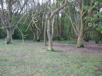
This wooded area was the most appropriate as it had both dense wood and more spread out mature trees which were both easily accessible at the edge of the wood. The dense woodland seemed the best option to create an eerie filming location but from my dark photo, the more spread out trees seem more suitable as the limited light means the dense wooded are would be much too dark to capture a quality image. So we've chosen this less dense woodland as a filming location
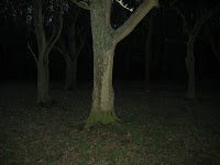
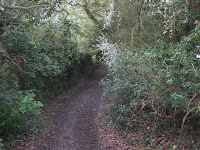
This location offered both the urban alley we had planned to feature but also this wooded alleyway which will add variation to the shots, as well as offering another appropriately creepy and eerie location to build the dark, mysterious tone we are hoping to achieve for parts of our trailer.
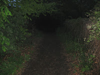
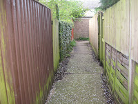
This more gritty and urban looking alleyway with broken fencing and mismatched panels is appropriate in presenting connotations of a harsh and hard environment as well as the obvious connotations an alleyway can present that are eerie and creepy, which is the effect we'd like to create with this shot.
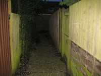
Now that the main practical components are organised, we're free to seriously begin to plan filming and also to think about creating a poster and magazine image using the same girl, to create a strong sense of continuity, which is vital in advertising campaigns to achieve a recognisable brand identity.
As well as this I've been looking around some potential locations to film the main bulk of our trailer which is the protagonist being chased. We think that a combination of both urban gritty locations and rural settings would create a variety of interesting shots, and present the idea of missing persons cases spanning all areas and settings across the nation. Urban settings can carry connotations of gritty, hard and harsh environments, whereas a rural setting can symbolise a quiet, lonely and mysterious environment, both extremes of which would be appropriate to present an eerie, creepy and appropriate setting for our action/thriller chase. We have already decided on some appropriate locations we'd like to feature in our trailer:
An alleyway- urban alleyways are commonly featured for 'stalkings' as they're dark, mysterious and carry the appropriate connotations.
A wood- Similarly this location is eerie and mysterious creating the desired atmosphere for the thriller elements of the trailer and adding variation to the other urban settings such as the alleyway.
I've been looking around various potential locations in the local area and having looked at the photographs I took we've selected the most appropriate location. There was both wooded, rural areas and built up urban alleyways and other appropriate places within quite a small vicinity. Which will hopefully cut down the filming time, as we need to film it all at twilight to have it dark enough to look effective, but light enough to have a clear and quality image. Without having to waste time travelling between locations, I'm optimistic we can achieve this.
These are the photos I took when scouting out locations. As this seemed to be the most promising I went back in the semi-darkness we have decided to film in to create a more appropriate and scary ambience, and took a second set of photos to ensure the locations would be appropriate in the darkness and they have come out very well, so we've settled on this area to film this main part of our trailer.

This wooded area was the most appropriate as it had both dense wood and more spread out mature trees which were both easily accessible at the edge of the wood. The dense woodland seemed the best option to create an eerie filming location but from my dark photo, the more spread out trees seem more suitable as the limited light means the dense wooded are would be much too dark to capture a quality image. So we've chosen this less dense woodland as a filming location


This location offered both the urban alley we had planned to feature but also this wooded alleyway which will add variation to the shots, as well as offering another appropriately creepy and eerie location to build the dark, mysterious tone we are hoping to achieve for parts of our trailer.


This more gritty and urban looking alleyway with broken fencing and mismatched panels is appropriate in presenting connotations of a harsh and hard environment as well as the obvious connotations an alleyway can present that are eerie and creepy, which is the effect we'd like to create with this shot.

Now that the main practical components are organised, we're free to seriously begin to plan filming and also to think about creating a poster and magazine image using the same girl, to create a strong sense of continuity, which is vital in advertising campaigns to achieve a recognisable brand identity.
Tuesday, 3 November 2009
Trailer research continued
I found a film that has a very similar plot and influences to our own text synopsis. The film is called 'Taken' and I decided to look at this in some detail as it should share some conventions with our own ideas and may offer some influences and ideas as to shots and transitions we can use in our own project.
(to watch with sound, click on below hyperlink)
http://www.screenrush.co.uk/video/player_gen_cmedia=18824936&cfilm=126169.html
One particularly effective use of editing in this trailer was the transitions between shots and the arrangement of shots on the screen. It uses a white flash in-between footage to create a very abrupt jump cut and a significant change to build excitement and to create a fast action tempo. It may also connote the flashbulb of a camera or clinical lights which can all be associated with crime scenes and connote danger. I thought this was a very effective transition. The arrangement of more than one shot on the screen at a time creates continuity and narrative and also builds excitement and adds visual interest. Many of the shots include high action scenes to create interest and heighten drama, but in addition many close ups and extreme close ups are included to build an emotive connection between the audience and the actors and establish a personal interest in the story and a bond to the text, thus encouraging them to want to watch the film. The use of emotive dialogue taken from the film further strengthens this interest. One particularly effective shot similar to one used in the Bourne Identity trailer I analysed is a shot through a peep hole in a door to see the barrel of a gun in the shot, this builds tension, drama and excitement and connotes danger with this very iconic symbol.
Tuesday, 20 October 2009
Focusing on teaser trailers
As our brief was to create a teaser trailer, as well as looking at trailers for inspiration and shot ideas, I'm also researching the conventions of a teaser trailer specifically and the ways in which it differs to the usual theatrical trailer.
I found a good definition on http://en.wikipedia.org/wiki/Teaser_trailer
'Teasers, unlike typical theatrical trailers, are usually very short in length (between 30–60 seconds) and usually contain little, if any, actual footage from the film. Sometimes, it is merely a truncated version of a theatrical trailer. They are usually released long in advance of the film they advertise. One of the reasons for the name "teaser" is because they are shown usually a long time (one or one and a half years) before the movie comes out, so as to "tease" the audience.'
The most obvious difference between the two trailer styles is in length, so the teaser trailer I'll produce will be shorter than typical theatrical trailers and so it is even more important in this case that the shots are short and powerful. However this may be considered easier to do for a teaser trailer as it can be ambiguous with very little or no cohesive narrative.
Monday, 19 October 2009
Storyboard and target audience
Having developed a synopsis earlier in the week, we have also begun to storyboard some ideas for actual footage in our trailer. We thought of many different shots that we could include and have started to develop some into a more complete storyboard. Some that we have considered to use include shots at night of a chase, this would create a very eerie and thriller element to the text to build tone and drama. We also want to include some POV shots of people being watched, we think this will be effective to build tension and will look very authentic in the trailer. We have also compiled various other possibilities but have yet to develop this and create a final storyboard.
However we have thought about our target audiences. Because of the action/thriller elements and the probable use of a young protagonist, our primary audience is likely to be a younger more modern audience perhaps between late teenage years and early thirties, both males and females. However, as the protagonist is female, a female audience may have a better personal identity gratification or feel a stronger personal interest in the text, making it a more female audience. However the use of action, conflict and thriller elements may add a more typically masculine edge. However it may also appeal to a secondary older audience. Once the storyboard and concept are more established we will be able to get a better idea of the audience gratifications and there appeal to our target audience.
However we have thought about our target audiences. Because of the action/thriller elements and the probable use of a young protagonist, our primary audience is likely to be a younger more modern audience perhaps between late teenage years and early thirties, both males and females. However, as the protagonist is female, a female audience may have a better personal identity gratification or feel a stronger personal interest in the text, making it a more female audience. However the use of action, conflict and thriller elements may add a more typically masculine edge. However it may also appeal to a secondary older audience. Once the storyboard and concept are more established we will be able to get a better idea of the audience gratifications and there appeal to our target audience.
Friday, 16 October 2009
Development of ideas and synopsis
Earlier this week me and my partner discussed and developed some of our basic ideas for our own trailer project. We decided to stick with the action/adventure genre, as this seemed realistic and achievable and we had some good ideas for this area. We have decided to base our film on missing persons cases. We want our story to follow the experience of a single person and that of their family and loved ones to add action, emotional interest and drama to the story.
This is the synopsis we developed from our ideas:
Based loosely on the disappearances of many people each year, our story will follow the fictional disappearance of an individual and their experiences and trauma as well as the experience of their family and loved ones. It will follow the detective process and methods used to search for this individual and the workings of the authorities on all missing persons cases. Giving an insight into this very real phenomenon.
Although we have developed quite a wide synopsis our trailer will not follow all aspects of the story as the limited time available to make maximum impact would make it unadvisable to include too much. Instead we will focus on the more exciting chase and action influences to gain interest and make a more memorable and intense teaser trailer. The phrase in bold will be the synopsis or focus for our trailer as opposed to the whole film.
Sunday, 11 October 2009
Some Trailer Research findings
Throughout this week I've been continuing with my research into trailers, with a focus on the action/adventure genre which will be a key influence on my own work. From all the ones I watched, I selected some I considered particularly effective to make some more detailed notes and analysis on. However, the majority of the trailers feature some key conventions that are common to many trailers for modern audiences. They tend to use a voiceover from a western male that has a very booming tone to build the atmosphere and drama of the text as well as provide key information and comments on the plot and content of the text. The music is used similarly as it crescendos which is effective and important to add excitement and tension at key moments of the trailer. Also very quick and abrupt edits or jump cuts are used to increase the tempo and therefore drama of the shots which are predominantly high action, with fewer narrative shots included to build the structure of the text and introduce the plot. I've picked out two I thought had some particularly effective points:
The Bourne Identity: http://www.youtube.com/watch?v=cD-uQreIwEk
This trailer like many other action/adventure genre trailers uses very fast and abrupt edits between shots to increase the tempo of the text and to heighten the sense of drama and excitement. I chose this one as it has a particularly effective transition between the lat shot of the protagonist characters face and the title of the film, using his image shown through the scope of a gun which is then a signature image shown on the iconic title and logo of the entire advertising campaign, to give adhesion to all the pieces of the promotional campaign, which is important in creating an idenitiy for the film. These very iconic props and stereotyped action scenes are useful in conveying the genre and tone of the trailer, this could be a very useful idea for our teaser trailer as we have a limited time to convey this mood.
Angels and Demons:
This was a notable trailer as although it was very effective it used less shots and less obvious action than many of the others which may be a more achievable idea with our limited budget and resources. It had one prolonged moving shot showing the key setting at night and instead used sound as a media tool to build the drama of the text. It used what sounded like radio footage to add authenticity and it used the familiar male, western voiceover to create tension and introduce the themes and plot. The music was atmospheric and the sounds of thunder created an eerie and dramatic tone. The weather shown in this trailer was effective as the stormy skies connoted danger and conflict. Towards the end of the trailer it showed several key shots in quick succession to heighten the action and add interest to the text. This trailer only being 1 minute and 14 seconds is also more similar to conventions of a teaser trailer.
(to watch with sound, click on below hyperlink)
http://www.screenrush.co.uk/video/player_gen_cmedia=18845226&cfilm=124371.html
Wednesday, 7 October 2009
Beginning trailer research
As the teaser trailer we must create is the primary practical component of our marketing campaign, I have begun some research into trailers. I aim to gather some knowlege of the conventions of trailers, particularly in the action/thriller genre which is a genre me and my partner have selected for our own product . I am also searching for inspiration for effective shots and edits that can create the most impact in the limited time typical of teaser trailers. I am using the websites:
http://www.youtube.com/
http://www.screenrush.co.uk/
http://www.youtube.com/
http://www.screenrush.co.uk/
Subscribe to:
Comments (Atom)